

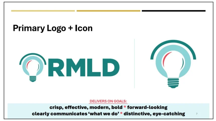
During this past Wednesday’s Board of Commissioners meeting, RMLD General Manager Greg Phipps cited marketing to customers, image concerns on mobile devices and scaling/printing issues as the primary reasons for the 1987’s logo rebrand. The new logo is emphasized as a modern, bold, and scalable design to reflect Reading Municipal Light Departments (RMLD) forward-thinking identity. The cost estimates for the transition ranged from $10,000 to $20,000, with a soft rollout to minimize expenses.
Not all commissioners were quite on board though. Bob Coulter questioned the light bulb’s “outdated appearance”, which he still prefers. Ray Porter preferred the old logo’s starburst for its solar connotation, suggested public input. Newest Commissioner Rich Swanson and former Chair David Talbot expressed concerns about the lack of external focus group testing, noting the logo’s retrograde appearance. CAB member, Charlie Protopapas, supported the light bulb for brand recognition among older residents. CAB member, Vivek Soni, suggested retaining black and gold colors but acknowledged reproduction issues. Lastly, newly elected Chair Pam Daskalakis proposed a compromise to proceed with digital rollout and gather customer feedback via newsletters or surveys.
The Commissioners agreed to proceed with a Spring digital logo rollout and collect customer feedback to address concerns, no formal vote was taken. The time frame to complete is roughly 9 months.
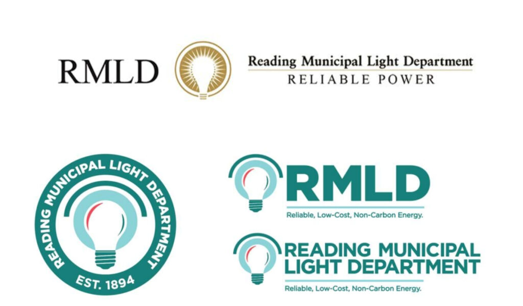
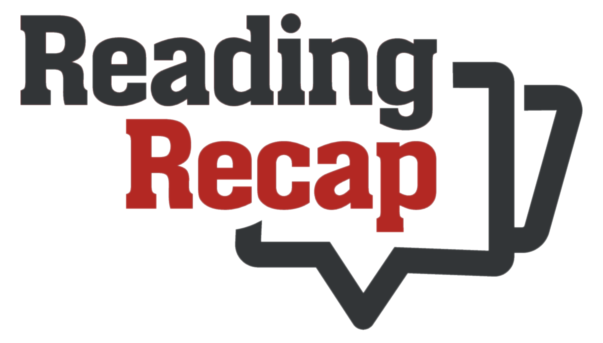
Below is the current black and gold logo at top with newer teal variations below.


Rebranding is a little expense we don’t need in this time of questionable economic stability. The old logo is fine. Save the expense & use those funds to directly help the customers.
There is nothing wrong with the current logo/branding. It would be a total waste of money to change it, and we (customers) know we’d be the ones paying for that change.